The mystery: We know when we drive through a city that temperatures warm from the fringe to the middle. We know UHI is real, but how much does it affect the official records? Is a 2010 city 0.3 K hotter than a 1960 city? How would we know?

Frank Lansner has come up with a way that might approximate the UHI effect — very roughly. It’s well known that UHI gets bigger as cities grow, but the devil is in the detail. Frank argues that it’s not just the size of the city that matters, but it’s growth rate.
The USA is full of large cities, but there is not much difference between the trend in satellites and ground stations there. Frank’s approach could explain this — most of the growth in human population has come in regions like Africa, not the USA.
He figured that if we compare satellite records to ground stations and see if there is a divergence, we might be able to see an indicator of UHI. The info coming out of satellites ought not be affected as populations expand, but the ground stations are often near population centres and they gradually get surrounded with more square-kilometers of concrete and a bigger buffer of UHI. Hence Frank sectioned up the world, and looked at the trends from both sets of measurements.
None of this is simple as Frank points out. Populations don’t just grow evenly across regions, nor does each 10% increase in population translate into the same increase in industrial output (and presumably heat). Indeed Frank finds the trend changes in different regions of the world. What ever the reason, then the significant result of Frank’s analysis is that the ground based temperature stations contain, on average, nearly half a full degree (0.46 K) of extra heat trend 1979-2010 when compared to the satellite based data, and it occurs in exactly in the areas of the world with highest population growth rates: The developing countries.
A 0.46K difference (for Africa, Latin America, and Asia minus Russia) is pretty darn significant especially as it’s only over 30 years. Is that UHI?
Why do ground based temperatures rise so much faster than satellite data in areas of the largest population growth? UHI? Coincidence? Or some natural effect? (And why isn’t a PhD student, or paid researcher doing these analyses?)
——————————————————————————————————
Given the vociferous nature of the comments thread on Franks site (where he previously discussed UHI). I’m offering it up to the skeptic world as a work in progress. Frank is looking for informed feedback.
————————————————————————————————————
UHI, Temperatures and population growth rate
Guest Posted by Frank Lansner
Also posted at his site Hide the decline
Can UHI be described as a function of population growth rate?
In short: Ground based temperature data are often measured from cities and airports Growth in populated areas might lead to faster warming trend in ground based temperatures – hence the UHI (Urban Heat Island) warming error in global temperature data. The problem is not significant when the temperature data is measured from satellites, and therefore:
If UHI has a measurable size, we should be able to see this by comparing ground based temperatures to UAH satellite temperatures, assuming we use a number of samples large enough.
In fact, if there is no sign of UHI in a comparison between ground based and satellite based temperatures, it would be hard to argue that UHI leads to an important warming error in global temperatures.
“UHI – Indicator”
Does this “UHI-Indicator” (the difference between ground based temperature data and UAH TLT data) then reflect UHI at all?

Population growth is slower in countries marked in green, blue or brown.
As argued in a previous article: we would expect to find more UHI error warming in areas with the largest population growth rate, not in areas with a constant population.
If the “UHI-indicator” does reflect some UHI-related warming error in temperature data, then we’d expect to see the effects all over the world: More population growth should lead to more UHI error.

Fig 1. Years 1979-2010.
I then examined the difference in GISS 1200km ground based land data vs UAH TLT land for 74 areas of the world, and this difference – “the UHI indicator” – I show on the Y-axis as a function of the population growth rate of each of the 74 areas in question.
Temperature data is accessible mostly grid for grid on the globe whole population data is mostly nationally accessible, and often also accessible on regional basis or countries. It is not possible then to make a perfect match between grid areas and national/regional areas, but all 74 areas are chosen by fitting best possible to a country or a row of countries and regions. The scarcely populated near-Arctic areas is not fit to study UHI generally and mostly left out. In addition I have mostly focused on continental areas:

Some countries like Russia, Canada and more have the problem that population is in one smaller area of the country and thus population data will basically reflect tendencies in those smaller areas. Therefore I have used regional population data for those countries. But even on regional basis the population is still often only appearing in one corner of the area, and thus some areas are not useful for a population trend comparison.

Fig 3.
Same data, now we see that not surprisingly areas of higher population growth are, for example, Africa and Latin America. There are not many data areas for single continents, and thus a trend-study of these is rough In any case, here’s how same data appears also showing trends from single continents/part of the world:

Fig4. The individual trends for the shown regions are however based on few data points, and the large “noise” in data does make the slope for the individual regions rather random. Removal of single data points of regions can change trends significantly, even to negative.(I have then made some experiments using GISS 250 km radius in stead of GISS 1200 km radius, wih rather mixed results for regions that need some further analysis.)
Many readers may now be thinking (like me): On the above figures we see, that the difference in ground based land temperature data vs. UAH TLT land data do occur most where population grows the fastest. But what if there is some completely different explanation? This could well be. For example, both the population growth and “UHI indication” occurs mostly in warmer countries, southern countries etc? So what if the temperature divergence in data for some perhaps even unknown reason just happened to take place in those southern areas? And had nothing to do with UHI?
To evaluate this idea, I have made illustrations below where I present ONLY data from a certain latitude bonds:

So, now all areas compared are equally south or north on the globe. Results:

Fig 6
And

Fig 7
This comparison still suggests: More population growth => more UHI warming error in temperature data. In addition, one could focus on only areas of same type, for example the deserts. Here data is collected from Mexico, Australia(WA,SA,NA), Sahara, Saudi Arabia and Southern Africa:

Fig 8.
Is there also a trend in the countries with deserts that population growth is accompanied by divergence in temperature data possibly indicating UHI?

Fig 9.
It appears that trends for deserts do not disprove much either.
So for now, conclusions in the article http://wattsupwiththat.com/2010/12/16/uah-and-uhi/ are not proven, but are perhaps supported to some degree.
Some thoughts on: Urbanization – a cold error?
I also want to address not only the size of a population in a region, but also the distribution which is changed by urbanization. Urbanization => cooling in ground based temperature data compared to satellite? In a situation where all cities in an area are growing, then we talk about the well known UHI warming error in the respective temperature stations.

Fig 10. A) Growing cities heats up thermometers, B) Urbanization might cool the rural thermometers on the ground?
As people shift from rural to city-life an increasing population might lead to cooling. If most of the cities have a falling number of citizens, then even though one larger city grows, then many temperature stations may be affected by a little less heat than normal. That is, if the UHI–trend error in temperatures is dependent on population growth, not population size.
In example B) if ten cities of 100,000 inhabitant’s loose 10% population while just one city of 1,000,000 inhabitants gains 10% inhabitants, then the net result might be cooling of average temperature stations. So area-wise, urbanization might lower warming trend line – and thus we have a warming UHI-effect fighting against a cooling urbanization effect, here shown or Australia:

Fig 11
However, a cooling urbanization effect would only exist if the population growth in the smaller cities is negative even though the total population grows.
If we then recall fig 4, then we see the trend lines for USA, Canada and Australia appears below the global average trend line. For now I can’t quantize the urbanization in a graph, but still I will show that urbanization have recently been significant in these areas:

A cooling effect of urbanization is obviously not directly comparable to the warming effect of UHI. When people move out of small towns the concrete and buildings are still there, the lower population number then only have an effect on the “warn activity” like showers and car driving etc.
But all in all, the possibility that some regions in addition to UHI experiences an “urbanization-cooling” helps explain why some regions on fig 3-4 have colder values than the average.
*************************
Conclusion:
Is it a coincidence that temperature divergence between ground based vs satellite based thermometers happens to occur mostly where population growth rate is largest and risk for heat-polluting thermometers is largest? That’s the question, and I am interested to see if other explanations than UHI will show up in the comments or later.
Just for the record: A difference in ground based temperatures vs UAH TLT is likely to not only be UHI, but also be adjustment problems and siting problems and more.
As long as we cannot rule out that there may be some other explanations for the connection “UHI-indicator” vs population growth rate, then we should take care not to conclude too much for now. But it is not getting easier to claim that UHI does not play a role in measuring the global temperature.
I have talked a lot about how different datasets are too scarce to conclude too much on. However, data in this writing does also show significant trends not easily ignored.
As mentioned to begin with, this little analysis deals with data already adjusted in several ways. That is, perhaps im searching for a UHI signal in data already adjusted for UHI. Here a reminder of how data has been homogenized to counter UHI effects:
http://climateaudit.org/2008/03/01/positive-and-negative-urban-adjustments/
In addition, we are dealing with GISS data using 1200 km smoothing radius. So, in some regions where we have rural and urban areas not too far from each other, things should be blurred out to some degree.
But, UHI adjustments and 250 or 1200 km smoothing generally only has regional effects perhaps hiding a UHI signal. But the above illustrations has been made to show different regions in comparison, and this approach is likely to omit most local UHI adjustments and smoothing effects. And when we do comparison across regions we see the industrialized areas (with lower population growth rate) separating strongly from the developing countries (with higher population growth rate):

—> The clear result of this writing is, that developing regions with high population growth rate in average has around 0,46 K more warming trend in GISS 1200 km ground temperatures than UAH TLT from 1979 to 2010.
No such trend difference occurs over industrialized regions with lower population rates 1979-2010 (and widespread loss of rural population)..
************
At least, we are missing an explanation to the obvious:
WHY does ground based land temperatures show much more heat trend than UAH TLT in regions with high population rate compared to regions with low population rate?
So far, I have not managed to answer this without pointing to the obvious: UHI.
** Post Scriptum A **
UHI is often described as a logarithmic function of population, so perhaps its in place to show that the log(Pop2010/pop1979) used i stead of annual growth rate of population is basically giving the same results:

** Post Scriptum B **
It can seem rather odd, that areas where hardly anyone lives, or where people perhaps lives in “caves” still should be able to represent a significant amount of urban heat in data.
However, due to GISS 1200 km radius (2400 km diameter) smoothing, an area can be totally without inhabitants and still represent UHI in GISS data,
Example, the Brazilian jungle:

Manaus in the middle of the “Brazilian jungle” has grown fast to a population like Hamburg of Germany, and Cuiabá to a size like Bremen. On the illustration the 1200 km radius from just these two series are shown. This way a huge area of “monkey jungle land” can be represented by urban GISS data – which should differ from trend measured from UAH TLT. And it does.
Also posted at his site Hide the decline where Frank has other posts like this one, as well as the lead-up UHI work to this. The discussions in comments are active, to say the least.
Other articles by Frank Lansner:
For personal dialog on population data etc. use [email protected] .
Temperature data, KNMI:
http://climexp.knmi.nl/selectfield_obs.cgi?someone@somewhere
Urbanization graphics;
http://www.statcan.gc.ca/pub/91-214-x/2007000/m002_en.gif
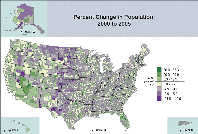
http://www.virginiaplaces.org/population/graphics/popgrowth2000-2005rate.gif
http://www.vision6.com.au/download/files/09640/790794/Australian%20Map%20orig%203004.gif


The discussion on UHI has often confused the existence of UHI (which can easily be observed by anyone with a thermometer who traverses a city) with delta UHI, the change in UHI over time. It is the latter that affects the temperature record, as Frank argues.
Thus it is important to try to understand the pertinent meta-data relating to UHI for each temperature station, and what has changed over time. Clearly if a temperature station was located on a small rural airstrip on the outskirts of a small town in, say, 1920, and that town has since grown to become a major city so that the temperature station is now within the observable UHI, then the temperature record will clearly be affected by the delta UHI effect over the past 90 years.
I am probably repeating what Frank is saying, but it seems useful to me to use the term “delta UHI” over time rather than UHI to minimise confusion.
10
This is really interesting.
Many years ago in the UK, I did some modelling of urban population growth trends. What we found were some interesting patterns between the changes in urban size, population density, and changes in population growth rate.
As I remember it, population growth rate is not a constant (although urban planners tend to assume that it is), but seems to have complex relationships with population density, as well as the size of the urban community.
In simple terms, what we found was that any moderate population increase results in an increase in population density – the existing infrastructure absorbs the increase. But the gradual increase in overall density – the population “pressure” – tends to reduce the the rate of population growth, so the relationship between the two is non-linear, and tends towards a steady state.
At some point (prior to the steady state) the population density triggers sufficient urban expansion to decrease the population pressure to the point where growth can continue. The history of urban expansion is therefore also non-linear, and tends to reflect the variations in population density, with a lag.
A dramatic population increase seems to trigger urban expansion earlier than a moderate one does, and manifests itself (in the British context) as “new town development” on the outskirts of a larger city, and does not require the population density trigger. At the time, we put that down to politics, rather than science.
So, my question is: Could the UHI affect be dependent on the population density, rather than on population growth rate, given that they are related, but different?
10
Sorry to be O/T, but Tim Dunlop wrote what I thought was an insightful piece about the lamestrem media and its fixation on trivialities and inability to fact check. Unfortunately he then had to toss in a couple paragraphs at the end disparaging the media for engaging with skeptics on climate:
http://www.abc.net.au/unleashed/43806.html
I was actually enjoying the article until he had to throw that meaningless kowtow to the IPCC at the end. Shows that he can talk sense when he wants to.
10
My response for ABC logging purposes 😀
10
Bulldust @ 5
Because global warming is a religion and a matter faith – you heretic!
Cheers,
Speedy
10
o/t but…unbelievable!
10 Feb: ABC: Flannery to helm climate change commission
The commission is being set up to help the Government build community consensus on the need for a price on carbon…
The body will be made up of climate experts.
http://www.abc.net.au/news/stories/2011/02/10/3135059.htm?section=business
10
Pat: #6
“Who will guard the guards?
Who can watch the watchmen?”
Juvenal, Roman Poet (attrib.)
10
Being of rural origins, I have been comptemplating what is now referred to as UHI for many years. The following is based on experience in southern Victoria.
Consider, the difference between the thermal properties of green grass and treetops versus black tar roads, concrete pathways, terracota rooftops. We can add to the list the total concrete mass in a city like Melbourne, the biblical proportions of concrete would be expected to be an effective heat store.
On topic, I expect the most significant effect to be the 3 sided ovens that we manufacture in cities (consider Melbourne Laneways/alleyways). There is little scope for wind to remove heat from these areas. Maybe the correlations with population growth are due to “boxed” urban streets?
10
As to UHI Canberra Australia may be interesting. I came here in 1975 then it had about 200000 (guess) people then. The temperature measurement for the city was and still is at the military air base next to the civilian one. The station started recording in 1939 and has a continuous record to the current day. In 1975 there was little there other than the airport. Our populatoin has grown to 330000 which has spread to all points of the compass but only recently (last 5 years say) has there been significant office development and expansion at the airport. This caused a large expansion in the roads to the airport. Is this a pattern are airports initially well away and then later rapidly subsumed?
10
Just the alarmist for Gillard !!
http://blogs.news.com.au/heraldsun/andrewbolt/index.php/heraldsun/comments/just_the_alarmist_for_gillard/
10
Pat @ 6:
A coloege just sent me that depressing information. Look at the membership:
Will Steffen? Seriously… This is putting the foxes in charge of the chicken coop.
10
Colleague… damn you typos.
10
I see ABC is almost falling off the left side of the spectrum – latest piece of the Greanpeace variety:
http://www.abc.net.au/unleashed/43868.html
10
And then there’s the RCI (Rural Crop Island) effect. High productivity agriculture (more photosynthesis) plus irrigation (more evaporation) results in cooling. You can notice this while driving through the central valley of California in the summer, where when driving by active fields, the temperature is as much as 1C cooler then when passing inactive fields.
UHI and RCI are present in the satellite data, but are buried in the average owing to limited spatial resolution. IR satellite imagery generally has pixel sizes of 10 km or so on a side, which are too large to discern incremental spatial changes in UHI and RCI.
10
My response to the naive Greenpeace boy:
The petrol tax thing struck me at the last minute in my little rant… he’s quite happy to count the fossil fuel subsidies (including diesel rebates I bet) but does not count the petrol taxes. That is called an epic fail in economics.
For the record a tax is a negative subsidy and vice versa. Easy to get the answer you want when you only count one side of the equation. Heck that’s like an accountant saying they are only going to count debits and not credits… yeah, why not!
10
Whenever the UHI is mentioned the alarmists invariably point to a comparison of the surface and satellite series and the very similar trends to date.
But when you compare GISTEMP with UAH to say 1990 there is a distinct divergence which strongly suggests that the warming at surface stations was exaggerated by (possibly) the UHI effect.
I have a hunch that Hansen and Jones seeing this obvious divergence (~0.1°C in 10 years) have gradually adjusted their series to accord with the satellite series; Hansen in particular using the 1998 El Niño to fudge the data.
Sure they are now almost in accord, but if you extrapolate that divergence back in time beyond the introduction of the satellite series it seems likely that the putative 0.8°C rise since ~1880 may be an illusion and that in particular the alleged T effective stasis 1940-1975 has been ‘propped up’ by the UHI effect during the rapid post-war growth and other sundry ‘adjustments’.
10
Mondo writes: “The discussion on UHI has often confused the existence of UHI (which can easily be observed by anyone with a thermometer who traverses a city) with delta UHI, the change in UHI over time.”
Yes exactly. This fundamental understanding is often not in place when people discuss UHI. For example at sceptical science they choose to compare London (that have been a multi million city ever since 1900) with its surroundings (although ALL of central England is one big urban area) and thus finds no difference in rural-urban trend. Interesting how they pick a one-city investigation to conclude anything in the first place.
Rereke, you write: “So, my question is: Could the UHI affect be dependent on the population density, rather than on population growth rate, given that they are related, but different?”
Hi Rereke! Thanks for interesting input, I believe that density as well as growth rate has some say. For each local situation these considerations depends on exactly where the thermometetre is placed, so my little analysis above just covers the overall picture, the grand average, where perhaps the population growth has impact in different ways. Imaginge a thermometre outside the city: In this case, the expansion is perhaps more important than density in the city centre.
K.R. Frank
10
Manalive, thanks for comment, you write: “Whenever the UHI is mentioned the alarmists invariably point to a comparison of the surface and satellite series and the very similar trends to date.
…
I have a hunch that Hansen and Jones seeing this obvious divergence (~0.1°C in 10 years) have gradually adjusted their series to accord with the satellite series; Hansen in particular using the 1998 El Niño to fudge the data.
”
Thanks for analysis, and I would like to add, that when you split up in GISSLand/UAHland, then suddenly the difference is not so little at all:
http://hidethedecline.eu/media/UAHUHI/UAHurban2.jpg
In addition: Yes, 1998 is small in GISS data allowing them to also maintain a warming claim in recent years etc.
K.R. Frank
10
Staying in the O/T mode, for the singularity fanbois out there here’s the latest post on WUWT:
http://wattsupwiththat.com/2011/02/10/worth-watching-watson/
Yes a computer is taking on the all-time Jeopardy champs live next week.
10
Bulldust,
I posted on the Greenpeace idiot’s little rant.
We’ll see if it gets through. The office holders ought to be arrested, charged with fraud, convicted and jailed for a few years. The rest are “useful idiots”.
Your point on nuclear was made long ago by the late Dr Petr Beckmann. I still have his “The Health Hazards of Not Going Nuclear”.
10
Just checked the Drum article – there is a bit of one handed typing there.
The current Drum poll question is “whether Tim Flannery would make a good head for the climate change panel?” . At the moment the poll has him looking “good” for the job.
The Climate Change Wiggle will be judging your children’s future.
10
The cooling from photosythesis is solar energy being stored instead of becoming heat. This must have increased globally due to the elevated CO2 encouraging photosynthesis. Now add floods.
It is a bit vague because of weather but have a look at what colour this map has for recently flooded places like: Pakistan, Northeastern Australia, The Sahara, The Amazon, Indonesia etc.
http://www.esrl.noaa.gov/psd/map/ANIM/sfctmpmer_01a.fnl.30.gif
Note what appears to be the comparison period is 1985 – 1996. Hmmm no 1998??
There is not going to be much photosynthesis on Greenland. Only the southern tip shows as cool.
10
Climate change: Why don’t Americans believe in global warming? | The Economist
http://www.economist.com/blogs/democracyinamerica/2011/02/climate_change
10
pattoh:
February 11th, 2011 at 5:21 am
The current Drum poll question is “whether Tim Flannery would make a good head for the climate change panel?”
Link to vote http://www.abc.net.au/thedrum/polls/
10
Off Topic:
Greg Combet on Newcastle radio, at approx 7.20am eastern summer time stated on 2hd Newcastle, “the climate committee is totally Independent from the Government and the likes of Tim Flim-Flam Flannery would not be pushed around by politicians such as himself, that the committee was made up completely of climate experts giving Australia the best outcome on climate policy.
My heart soared, I felt joy surge through my body, then a flock of pigs flying over crapped all over my car and I returned to reality, where we all know he doesn’t have to put pressure on the committee as their all converts already.
10
You get the impression that HerRanganess Fabiana & Co. got some advice from a group of Burmese generals on how to set up a commission.
10
This is not directly relevant to this thread but it is to recent threads on “extreme weather events”
http://rogerpielkejr.blogspot.com/2011/02/two-new-world-bank-papers-on-climate.html
10
check out what scientists have been telling us over the years
http://butnowyouknow.wordpress.com/those-who-fail-to-learn-from-history/climate-change-timeline/
very educational
10
Frank,
I don’t understand how you can use datasets that have been adjusted and smoothed to remove the UHI signal to find the UHI signal, especially given the inconsistence in the way they have applied the adjusting as shown at CA?
Secondly, couldn’t you test your hypothesis by limiting your study to only different regions in the USA? I understand you are trying to show a global effect, but maybe by simplifying the problem and using the higher resolution datasets of the US something might pop out.
I say the USA because it’s a pretty homogeneous society relatively, the temp measurements there are all roughly done and hangled in the same way and the t-records in the US are long and numerous. Also there would be very precise census data to compare pop. growth rates too… Building codes, urban planning, traffic management styles and energy consumption doesn’t differ much from one end of the continent to another compared to the range of social adaption one might experience globally. and finally, because you could compare regions, like East Texas (Houston, DFW, Austin) which has experienced massive growth, with areas like Pittsburg/Detriot/Cincinati that have experience negative growth.
Although, as you note, old cities experiencing population declines in the rust belt still may have most of the old infrastructure left behind, they also have far more mature trees than, say, a brand new housing sub-division in Florida. The same is true for many inner-city neighborhoods, which may now produce less of an UHI signal than when they were first constructed back in say, the 1950 or 60’s. Or maybe not, because now they all have AC units. You could test your idea that cities in decline don’t show a reduction in UHI with the 100 year t-records in rust belt cities, where you have cities that grew rapidly from 1900 to 1960, then peaked by 1975 and went in decline to this day. Just a thought.
Good luck with your research! 😉
10
As for my post at 15, I would like to know how that transgressed the ABC blog posting rules, because it clearly did not make it past the mods. Maybe I should bring this up at the Bolta … he would love this kind of ammunition.
10
OK last attempt at said thread p[osted from the home IP:
I am seriously starting to contemplate an FOI on the moderators at the ABC and publishing about the biased deletions that do not match their left-wing ideology. As I am currently dealing with an FOI at work I know exactly how much fun they are (nothing I did of course).
10
Percival Snodgrass; Thanks for the link to “Why don’t Americans believe in global warming?”
It’s always amusing to listen to the elite “explain” why most Americans don’t believe them. It’s usually because we’re too dumb to see the obvious — which, of course, doesn’t really need anything as crass as “evidence”. But, sometimes it’s because we’re Biblical Literalists, or anti-science, or Flag-waving nationalists, or greedy capitalists, etc. About the only thing they left out is “gun-crazy” — but I admit I didn’t read all the way through the comments.
Maybe someday, one of these articles will really floor me by sticking to arguments about facts and data. …Nah.
10
This is a must read for people interested in the Australian economic perspective of climate change policy:
http://www.theaustralian.com.au/news/opinion/climate-adviser-misses-the-point/comments-e6frg6zo-1226003951163
Henry Ergas succinctly slams the economic arguments (that the Greens and others make) that it is in Australia’s interest to act early on climate change. It defies all economic logic and I have been saying this for ages, but Henry sums it up elegantly.
10
Flannery sells the policy of the government which pays him
http://blogs.news.com.au/heraldsun/andrewbolt/index.php/heraldsun/comments/flannery_sells_the_policy_of_the_government_which_pays_him/
WHAT PLANET DOES THIS MORON FLANNERY LIVE ON???
FLANNERY IS NOTHING BUT A CHARLATAN AND A TRAITOR TO HIS OWN COUNTRY!!!
10
POLL – Would you support a climate tax?
http://www.theage.com.au/polls/environment/climate-tax/20110211-1aotb.html
READ MORE HERE:-
http://blogs.news.com.au/heraldsun/andrewbolt/index.php/heraldsun/comments/readers_disappoint_age/
10
Well neither post of mine made it up on the Greenpeace ABC posting so I think I can safely assume that they have been “moderated” to the ABC borehole. I shall write to Bolta about it tomorrow… I am sure he likes that kind of thing.
10
Wes Geroge, thanks for commenting, you write: “I don’t understand how you can use datasets that have been adjusted and smoothed to remove the UHI signal to find the UHI signal, especially given the inconsistence in the way they have applied the adjusting as shown at CA?”
Exactly, im against the odds de to these adjustments and on top f this 1200 km smoothings 🙂
These combined adjustment types blurs out things a lot and should remove a detectable UHI result in puplib data pretty much.
The BEAUTY of comparing USA with Aftica is exactly, that no 1200 smoothing reaches africa from USA. And what ever UHI adjustment smoothing done between urban rural stations in the USA is not likely to smoothe things out between USA and Africa 🙂 See?
So for each region in my writing i dont expect to see much in public available data, just a flat curve… BUT! When making these compares USA-Africa, or all industralized regions vs all developing regions, then by magic, the smoothed data has not much change of “dissapearing” the HUGE differences actually right there in data.
So USA internally: Yes if I had relevant data it would be perfect.
For now smothings has not much effect when cmparing regions.. and voila, a huge signal appears. At least until some other explanation than UHI emerges, this appears really interesting.
Remember, a 0,46 K warming trend over just the perios 1979-2010 in GISS land compared to UAH land for ALL Africa, Latin America and Asia-minus-Russia is really significant!
K.R. Frank
10
K. R. Frank, thanks for your informative reply,
Are you saying that the original, un-adjusted, un-smooth data is unavailable for third party researchers to use in their own work? If not. Why not?
If so then I’m a bit shocked.
10
Correction to post 36… my last attempt to post on the ABC Greenie blog finally made it up there. Maybe the threat of FOIs made them sit upright for a change.
10
Hi Wes – And thanks for commenting!
Yes, the KNMI GISS data is data after adjustments gridwise available. We do not have genuine RAW data available from GISS and CRU. CRU then say they have “lost” original data… and so, sadly they cant hand it over. I believe GISS is presently under pressure to deliver original data – can someone confirm?
Steve McIntyre has occasionally had luck to get hand on some specific raw data, but there is a long way to go.
This lack of temperature data openess is one of the reasons that i have tried to dig in the past for temperature data published before around 1984 when GW agende heated up:
http://hidethedecline.eu/pages/posts/the-perplexing-temperature-data-published-1974-84-and-recent-temperature-data-180.php
Kind Regards, Frank Lansner
10
Looking for maximum temperatures strikes me as completely futile.
Place thermometers in desert areas far from human habitation.
Observe MINIMUM temperatures during dry periods, will usually be at night. If minimums are seen to be rising over a period of years then we do have a problem.
10
Good point, CO2isnotevil @14. UHI and RCI need to be kept in the broader context of albedo. If 70% of the planetary surface is ocean and oceans absorb 96% of insolation then the essential raw material, as it were, for clouds and CO2 to trap heat is only 4% of this 70% of global surface area, ie, just 2.8%, which is barely statistically relevant.
The whole theory of climate forcing can only function over the remaining 30% of planetary surface which is land. And the more moisture incorporated in that landscape, either as lakes or in living vegetation, or in soil, the lower the albedo and the lower the respective contribution to greenhouse theory.
And of course, the highest albedos come from snow, deserts, concrete and rooftops. This is the critical flaw in the GHG theory. There is no comprehensive recording of changes in albedo over the past 150 years. There are major variances in both positive (cooling)and negative (warming) elements.
Major river flow capture and subsequent diversion to both crops and suburban gardens, especially when evapotransiration is dispersed in time, from winter flood flows to summer crop transpiration, and from wet year flows to subsequent dry year flows, has a major cooling effect through decreased albedo.
Conversely, reduced pasture cover in arid zones, by grazing, firestick farming, reductions in tree density, midsummer spraying of ground cover to accumulate soil moisture for winter crops, along with urbanisation, all produce major increases in albedo and major increases in the theoretical potential for heat capture by so-called greenhouse agents.
Ironically the most reflective surfaces, ice and snow, are mostly found in the poles where angles of incidence are lowest and insolation over surface areas is substantially reduced. The snow fields found close to or in the tropics are all found at altitudes above 6,000 metres where the total mass of atmosphere above them is only half the volume at sea level. And the next layer below these snow fields is alpine deserts, also with high albedo, but with only half the volume of atmosphere for warming agents like CO2 and water vapour to function in.
The key point is the fact that once all these adjustments in albedo based warming potential are made then it becomes clear that the area of the planetary surface, and the atmosphere above it, that is capable of capturing additional heat due to compositional change is really quite small. And that means that changes in land use, including UHI and cropping, are of far greater relevance than their respective land areas would indicate.
10
Here is a NWS GOES infrared satellite image of Minnesota on a cold night. The core of the city was –13F, while the airports were 3 and 4 degrees colder. The rural areas wereas cold as –29F.
Twin Cities’ Urban Heat Island visible from space:
http://minnesota.publicradio.org/collections/special/columns/updraft/archive/2011/01/twin_cities_urban_heat_island_1.shtml
10
“Desert Trends”
The fundamental problem is that is that population numbers are not available at the required density for much of the world.
I.E. The average population density for the Saudi Province that includes Riyadh evaluates to rural. There is no reliable population data for Riyadh, official population statistics are kept at the province level. So the thermometer in Riyadh ends up being a rural thermometer even though it is situated at a major airport in the middle of a massive urban area.
Africa has the worst thermometer coverage and the population statistics tend to be kept at the provincial level rather then city or township level.
10