Recent Posts
-
Typhoon Bavi strikes solar parks in China giving a new meaning to “distributed energy”
-
Friday
-
PM will force Data Centres to use renewables (because he knows they would use gas or coal if they could)
-
Thursday
-
The crisis in conservative politics: Half the voters are fed up with climate propaganda, and the Liberals ignore them
-
Wednesday
-
The Bankers bullied Australia into Net Zero
-
Tuesday
-
Monday
-
Sunday
-
Climate change causes child marriages
-
Saturday
-
Friday
-
Vote Left to get expensive electricity
-
Thursday
-
Lucky us, The UN deigns to not list the Great Barrier Reef as ‘in danger’ (yet again)
-
Wednesday
-
Blackouts and maintenance problems hit farmers forced onto solar and batteries in Western Australia
-
Tuesday
-
Monday
-
Sunday
-
One Nation are now the Party of the workers, and Labor the party of wealth and academics
-
Saturday
-
Net Zero anyone? USA bets big on coal and gas — overtakes China in spending.
-
Friday
-
Winning: Trump persuades The World Bank to drop its huge spending target on “climate”
-
Thursday
-
Bafflement?! Germany, a global leader in renewables but has one of the highest EU electricity prices
-
Wednesday
-
Horse-drawn carriages must have caused a Megadrought in Europe in 1540, right?
-
Tuesday
-
Monday
-
Sunday
-
UK facing devastating 36 degree heat — can’t decide whether to use air conditioners or rip them out
-
Saturday
-
Batteries failed on day One: A four day wind drought in South Australia wreaks havoc, high prices
-
Friday
-
The UN wants to be One World Government and it starts with a carbon tax on ships and planes
-
Thursday
-
What if Global Warming was just because something made the clouds go away…
-
Wednesday
-
Snowy 2.0 is the Trillion dollar Black Hole of Australia — sucking in energy, money, land, industrial relations, the dollar, our lifestyle
-
Tuesday
-
Monday
-
Winter Solstice
-
Saturday
-
We were throwing-renewable-energy away at record levels in 2025
-
Friday
-
Pauline Hanson, the centrist, just wants a free market in electricity, and an end to the renewable energy bribery
-
Thursday
-
Blame the Climate Yeti again for making your life more expensive! (It’s a smokescreen)
-
Wednesday
|
“Gale Force” cherries coming your way…
Two weeks ago, it was all over the news. The ocean near Perth (where I live) was rising at the terrifying rate of 9-10mm per year since 1993, which was, shockingly, “three times the global average”. (Since Perth is flatter than flat, at this rate, in a few years everything bar Kings Park and a few sky-scrapers would be washed away). The myth started because a government department that knows a lot about our roads, trains, and buses wrote a dot point in a Fact Sheet. That was the State of Australian Cities report, and a pollie (Albanese) raved. Then the West Australian newspaper headlined it, and it all got out of hand.
In contrast, Chris Gillham got the raw data (something you’d think The Department of Infrastructure might have thought of), and shows below why its nonsense on stilts. The rate is not measured from when records began, but from 1993, which (surely it’s just a coincidence) also happens to be the lowest level in local tide gauges since 1941. (See that second last “dip” near the right-end in the graph below?) If they’d started the “rate” from the year 1999, the headlines […]
We’ve all heard the dire prophesies: Rising seas will reshape the world’s coastlines, a one meter rise will inundate 7000 sq mi of dry land, and cost over $100 billion in the United States alone. Worse, we thought things were bad before, but now it’s even rising faster than we predicted. (“We” being the unvalidated computer simulations, and “rising”, as it turns out, being one interpretation of some highly adjusted, carefully selected data, all possibly “corrected” by one outlying tide gauge in Hong Kong).
Nils-Axel Mörner is here to point out that the raw satellite data shows barely any rise, and furthermore, the observations from places all over, like the Maldives, Suriname, Tuvalu, India, Bangladesh, Venice, and Germany show not much either. It’s close enough to zero to call it “nothing”. Oh.
But that’s only spots from The Atlantic, The Pacific and The Indian… there are other oceans. 😉
As we graphed before with Frank Lansner, most of the current “rise” is due to man-made adjustments, not man-made emissions. According to Mörner, it’s not that the sea levels are rising less than expected, it’s more like they aren’t rising much at all, and haven’t been for years . — Jo
[…]
It’s hard to measure sea levels, because land often moves up and down too (which is known as “isostatic“). But Australia is stable tectonically, so the Australian sea-level record is more useful than most. It preserves the holocene era and the rises and falls, and correspond more with glacio-eustatic (ice equivalent) sea-level changes, rather than changes in land masses.
During the coldest days of the last ice age (known as a glacial maximum) 20,000 years ago, the oceans were 125m lower than today. They peaked at around 1 -2 meters higher than present between 9000 and 5000 years ago, and have been trending down ever since. Our current rate of 30cm/century (if that continues) hardly seems unprecedented or highly unusual. And 10% of that is apparently due to an isostatic “adjustment”. Worse, if you look at the raw data, the rate is closer to zero. Hmm. Lucky we have all those adjustments eh?
If Australian sea levels keep falling at this rate, we might really need to save That Reef.
Clearly there are many details yet to be worked out about sea-levels.
That phenomenal rise out of the ice age:
…
WA and NSW coastlines are considered the […]
Frank Lansner’s first graph surprised me. It’s well known and often quoted that sea levels have been rising by 2-3mm a year every year for the last 20 years. But it’s not well known that the original raw satellite data doesn’t show that at all. What astonished me was the sea levels first recorded by the Topex Poseidon satellite array showed virtually no rise at all from 1993-2001. Surely not, I thought. I asked sea-level expert Nils Axel-Morner, and he confirmed: “Yes, it is as bad as that.” Now, given that Envisat (the European satellite) showed no rise from 2003-2011 (until it was adjusted) that means we have almost 20 years of raw satellite data showing very little rise. We thought satellites would finally give us a definitive answer on sea levels. Instead, like the tide gauges, and every other tool available to mankind, apparently satellites systematically underestimate the rising trends. And despite the speed of light being quite quick and all, it can take years for the data to finally arrive. Sometimes 4 or 5 (or 10 years) after the measurement was made scientists “discover” that it was wrong. Now of course, any one of these adjustments could be for very legitimate reasons and give us results closer to the truth. But the adjustments always bring data closer to the modeled trend. It’s decidedly non-random. Either there is a God who thinks teasing climate scientists is spiffy, or else there is something fishy going on, and some investigative journalists need to ask some investigative questions. Is that sea-level rise due to global warming or is it due to global adjustments? — Jo
————————————————————————————————————-
Edited by Jo Nova
Sea levels – the raw data is always adjusted upwards
[caption id="" align="aligncenter" width="506" caption="The raw data on sea levels is repeatedly adjusted "up""]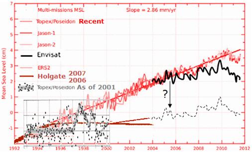 [/caption] […] [/caption] […]
The answer seems so bleeding obvious. Local governments are ruling on what people can do with their own land if it happens to be near seas recorded as rising at a frightening 1mm per year. Home owners are losing options and home value, not because of the rising water, but because of rising nonsense.
Let’s assume that IPCC projections might, incredibly, actually come to pass — why don’t the councils just get all residents to sign a clause before they buy or renovate. We the residents and potential residents, won’t mind signing that we have seen The Official Council Climate Warning:
—————————————————–
“The IPCC estimates the oceans may rise by (insert wild prediction here).
The council cannot be held responsible for the weather, and will not hold back the ocean.
Buy or renovate at your own risk!”
—————————————————–
Who has more incentive to assess the threats to a house (your house): a/ you, the homeowner who just hocked yourself to the grave and wants to live in it, hand it to your kids, or on-sell it for a decent quid; or b/ the local councillors who will never set […]
The Daily Telegraph exposed the NSW state government protecting the world from some dangerous scientific analysis of sea-levels. The officials pulled papers and posters within days of when they were due to be released, late in September 2011. Doug Lord examined 120 years of tidal data from Sydney Harbour, and found a 1 mm year on year rise which didn’t fit with the 900 mm rise projected by the Wizards of Climate Change at the Department. He finds the official figures exaggerate ten fold.
Ken Stewart has taken the dangerous data from 19 sites around Australia and finds it averaged 1.4 mm/year over the last 100 years. He finds about an 8-fold exaggeration. This is another sordid tale in the Science-perverted-for-PR category.
Sea Level Change in Australia: What’s Likely?
The mean sea-level rise recorded at 19 stations around Australia (warning, data is limited in the first half of the series). The trend is a steady rise. The last 20 years is not unusual.
Seas have been rising in a reasonably continuous trend around the world since 1800. The last two decades are not unusual.
9.4 out of 10 based on 87 ratings […]
Fans of man-made global warming frequently tell us seas are rising, but somehow forget to mention the rise started 200 years ago, long before our coal-fired electricity plants cranked up, and long before anyone had an electric shaver, or a 6 cylinder fossil-fuel-spewing engine. Something else was driving that warming trend.
Here is the data from tide gauges going back 300 years from a paper by Jevrejeva et al 2008.
[Graphed by Joanne Nova based on data from Jevrejura et al located at this site PMSML]
This graph was calculated from 1023 tide gauge records [Jevrejeva et al., 2006] going back to 1850.The 2008 study extended the record further using three of the longest (though discontinuous) tide gauge records available: Amsterdam, since 1700 [Van Veen, 1945], Liverpool, since 1768 [Woodworth, 1999] and Stockholm, since 1774 [Ekman, 1988]. Obviously since there are only three old records, the error bars are a riot.
The Jevrejeva paper is also useful for portraying the 60 year rolling cycle. The regular ups and downs are obvious when the rate of change is plotted (see below).
7.5 out of 10 based on 20 ratings […]
It’s worse than we thought. The models I mean — they are more hopeless at predicting things like regional sea-level rise than we had reckoned, and we thought they were god-awful.
Remember the awe-inspiring, grant-inducing and legislation-bending Victorian report suggesting “up to 45,000 Victorian homes – worth $10.3 billion – face inundation….Across Australia 247,600 individual buildings valued at $63 billion could be damaged or lost, while major infrastructure, including Sydney and Brisbane airports, are at risk of being flooded by increasingly damaging storms.” (The airports, forgoodnesssake, were going to be underwater, and the 737’s would need those optional float thingies to “land” where there wasn’t much … land.)
Then the poor residents of Port Albert were told to build houses on stilts to avoid the feared sea-level rise (and in a double dose of bureaucratic jeopardy: at the same time they had to keep their roof-tops below the “heritage” line — making houses fit for pygmies).
Those Hollywood-style-apocalyptic flood results are based on an estimated “1.1-metre sea level rise by 2100”. Let’s think that through: current sea level is rising roughly 2mm – 3mm a year, and thus, to hit that 1.1 metre total by 2100 those global seas will […]
Just in case you missed it, there has been yet another example of data manipulation in the endless round of adjustments that bring reality closer to the models. Thanks to James Taylor in Climate Change Weekly for drawing our attention to it.
Sea levels are one of the top five most critical measurements to tell us about the planet’s “heat”. Remember, they say “it’s worse than we thought” and that sea level rise is accelerating. Yet the measurements by the best equipment available — satellites — tell of a steady linear rise of just 3mm year after year, except for lately, when it’s been lower. (What kind of scientist can’t predict where a straight line is headed?)
Sea level is hard to measure — the sea is not flat — the ground also moves, but satellites measure the world’s oceans every ten days to an accuracy of several millimeters, and what’s more, they measure it compared to the center of the Earth (see below). NASA says so. So it is hard to explain why, after delaying the latest (shrinking) results for a couple of months past the usual posting date, they now announce that they’ve added “a correction of 0.3 […]
SOURCE: Semi-Satirical News
Preschooler outdoes climate models
Back in 2001, little Alby Brushtail was just 4 when he predicted global sea levels for a decade by drawing a straight line through a graph. Today, Will Steffen, Director of the Climate Institute admits that global climate models are woeful at predicting sea levels in a story titled: “Sea levels rising at top end of estimates”.
The failure of the sophisticated models is all the more baffling because by 2001, global sea levels had been rising at the not-so-tricky, fairly steady rate of 3mm a year for the previous nine years. Despite this simple linear trend, even with the worlds best equipment and budgets of millions, the top experts only barely managed to predict future sea levels within their broad error margins.
In the end, they couldn’t outdo the four year old who drew the line in with an orange crayon in his preschool class and who simply said that the 3mm a year trend would “just keep going”.
For his remarkable success in 2001, Alby credited Mr Squiggle, but says he’s moved on now, and uses a […]
Are the small islands of the South Pacific in danger of disappearing, glug, under the waves of the rising ocean? Will thousands of poor inhabitants be forced to emigrate, as desperate refugees, to Australia and New Zealand? Has any of this got anything to do with man-made emissions of CO2?
By looking closely at the records, it turns out that the much advertised rising sea levels in the South Pacific depend on anomalous depressions of the ocean during 1997 and 1998 thanks to an El Nino and two tropical cyclones. The Science and Public Policy Institute has released a report by Vincent Gray which compares 12 Pacific Island records and shows that in many cases it’s these anomalies that set the trends… and if the anomaly is removed, sea levels appear to be more or less constant since the Seaframe measurements began around 1993.
Sea levels: The El Nino / tropical storm anomaly in 1997-1998 is clear. A long sustained rise is not.
Take the infamous Tuvalu for example. It’s sea level rise was reported as 5.7 mm/year back in 2008. Now it’s calculated as 3.7mm/year. But look at the Seaframe Graph – its flat. It is universally forecast […]
Dr Andrew Glikson (an Earth and paleoclimate scientist, at the Australian National University) contacted Quadrant offering to write about the evidence for man-made global warming. Quadrant approached me asking for my response. Dr Glikson replied to my reply, and I replied again to him (copied below). No money exchanged hands, but Dr Glikson is, I presume, writing in an employed capacity, while I write pro bono. Why is it that the unpaid self taught commentator needs to point out the evidence he doesn’t seem to be aware of? Why does a PhD need to be reminded of basic scientific principles (like, don’t argue from authority). Such is the vacuum of funding for other theories that a debate that ought to happen inside the university obviously hasn’t occurred. Such is the decrepit, anaemic state of university science that even a doctorate doesn’t guarantee a scientist can reason. Where is the rigor in the training, and the discipline in the analysis?
Credibility lies on evidence
by Joanne Nova
April 29, 2010
Reply to Andrew Glikson
Dr Andrew Glikson still misses the point, and backs his arguments with weak evidence and logical errors. Instead of empirical evidence, often […]
Dr Andrew Glikson writes for Quadrant and I respond .
This is a copy. It begs the question. Dr Glikson, is an Earth and paleo-climate scientist at the Australian National University. He’s paid to give us both sides of the story.
No, Dr Glikson
by Joanne Nova
April 19, 2010
Dr Andrew Glikson says the right motherhood lines [see: Case for Climate Change]: he talks about empirical evidence, and wants evidence based policies. All this is good, yet he sidesteps the main point — what exactly is the evidence for the theory of man-made global warming? It’s the only point that matters, yet when he presents evidence it’s either not empirical, not up to date, or not relevant. Why?
By hitting all the right key phrases a reader might accidentally think that Glikson is presenting key evidence and good reasoning. Take this for example: Glikson fears we’re turning away from evidence-based policies. (Me too!) But to complete the sentence he lists all the committees who predict bad weather 90 years from now. It makes for good PR, but is not scientific evidence.
Committee reports count as “evidence” in a court of law, but in science, certificates, declarations, contracts, commission […]
|
JoNova A science presenter, writer, speaker & former TV host; author of The Skeptic's Handbook (over 200,000 copies distributed & available in 15 languages).

Jo appreciates your support to help her keep doing what she does. This blog is funded by donations. Thanks!


 Follow Jo's Tweets
 To report "lost" comments or defamatory and offensive remarks, email the moderators at: support.jonova AT proton.me
Statistics
The nerds have the numbers on precious metals investments on the ASX
|


Australian sea level rises exaggerated by 8 fold (or maybe ten)
The Daily Telegraph exposed the NSW state government protecting the world from some dangerous scientific analysis of sea-levels. The officials pulled papers and posters within days of when they were due to be released, late in September 2011. Doug Lord examined 120 years of tidal data from Sydney Harbour, and found a 1 mm year on year rise which didn’t fit with the 900 mm rise projected by the Wizards of Climate Change at the Department. He finds the official figures exaggerate ten fold.
Ken Stewart has taken the dangerous data from 19 sites around Australia and finds it averaged 1.4 mm/year over the last 100 years. He finds about an 8-fold exaggeration. This is another sordid tale in the Science-perverted-for-PR category.
Sea Level Change in Australia: What’s Likely?
The mean sea-level rise recorded at 19 stations around Australia (warning, data is limited in the first half of the series). The trend is a steady rise. The last 20 years is not unusual.
Seas have been rising in a reasonably continuous trend around the world since 1800. The last two decades are not unusual.
9.4 out of 10 based on 87 ratings […]