What a bombshell. Despite the non-stop stories of unprecedented heat the original data at 60 of the oldest sites across Australia shows there are no more Very-Hot-Days now than there were early last century. That’s no trend in 40 degree days for 100 years. No change — that is, until the Bureau of Meteorology adjusts the data…
After we were shocked at the latest ACORN changes to our Very Hot Days data, I asked Chris Gillham if we could see the effect of Bureau of Meteorology changes to the original raw data – and he replied it would be too time-consuming writing the code to calculate 40C+ days among the millions of daily temperatures from 112 weather stations across Australia since 1910. Then he did it anyway.
Wow. In 2011, the BoM’s ACORN 1 adjustments wiped out some of the “very hot days” recorded at weather stations in the early 1900s. These were records that had stood for a whole century. Then, quietly six years later, the ACORN 2 readjustments turned the statistical air conditioner on again and cooled people from 100 years in the future.
It’s all especially miraculous given that even the old World War I data was recorded in official BoM-approved Stevenson screens. The BoM won’t consider pre 1910 data because it wasn’t standardized, but even when it is, they still have to “fix” it. And in the intervening years after 1910, the Urban Heat Islands have grown and electronic equipment that can record one-second-records have been introduced across the nation. With the old equipment, 40C+ extremes were harder to get than with today’s micro-minute spikes caused by gusts of hot air rolling off carparks and tarmacs.
What we see in the 60 longest running ACORN sites, all open in 1910, is that the raw temperature data had just as many “very hot days” in the World War I era as it does now. Oh boy.
No wonder the BOM was keen to move the “Very Hot Days” graphics and data and tuck them away in a remote page on their website.

History changing before your eyes.
Here’s a PDF copy of these three animated graphs side by side.
Chris also analyzed larger pools of sites (see below) but these include new stations that have opened since 1910, many of which are in hot arid locations that skew the averages as the proportion of “hot region” thermometers grows. The addition of new “hot” stations probably makes an upward trend all by itself. The 60 long-term stations then, are more useful because they’re the originals, even though many of them have shifted down the road from post offices to airports and got new electronic gizmos. None of them are ideal, but at least they are in the same locality.
Presumably with a million-dollars-a-day the Australian BoM might have been able to do this graph themselves. But somehow we need unpaid volunteers to tell Australians basic things about the trends across the country. With billion dollar decisions about how to change the global weather, you might think a responsible bureau would want to let Australians know that the original temperatures recorded show there are no more 40C+ days now than there used to be?
— Jo
______________________________________________________
No more extreme hot days in Australia than 100 years ago
Guest Post by Chris Gillham, who maintains waclimate.net
Despite a community belief that global warming is creating a climate of extremes with more very hot days in Australia than ever before, analysis of the Bureau of Meteorology’s 112 ACORN weather stations shows nothing much has changed since 1910.
The BoM defines a very hot day as having a maximum of 40C or greater, and the bureau’s own official data show that the recently released but virtually unknown ACORN 2 dataset has significantly increased the frequency of very hot days compared to its predecessor, ACORN 1, mostly by decreasing 40C+ days in the first half of the 1900s (see blog post).
Analysis of the annual 40C+ average numbers and temperatures at the 112 stations allows a comparison between original RAW daily observations and the homogenised ACORN 1 and ACORN 2 datasets. The following analysis is from 1910 to 2017 as this is the final full year of ACORN 1 daily temperatures.
The first analysis compares the three datasets at the 104 non-urban ACORN stations used by the bureau to calculate national and regional average temperatures …

Australian Very Hot Days, Graph, Bureau of Meteorology, Chris Gillham.
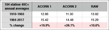
It’s clear that ACORN 1 reduced the number of RAW very hot days in the early 1900s, and ACORN 2 has created a staircase.
However, the animation nevertheless suggests a RAW increase in the annual number of very hot days in Australia, although the observable step changes coincide with 1972 metrication and the introduction of automatic weather stations in the mid to late 1990s that are believed to increase maxima because of their instant electronic response to warmth compared to the slower responsiveness of liquid thermometers. The very hot day increase in the new millennium also coincides with the introduction of smaller Stevenson screens that decreased their internal space by almost 74%.
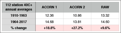
The trend and dataset differences in the 104 non-urban stations are similar among all 112 ACORN stations …

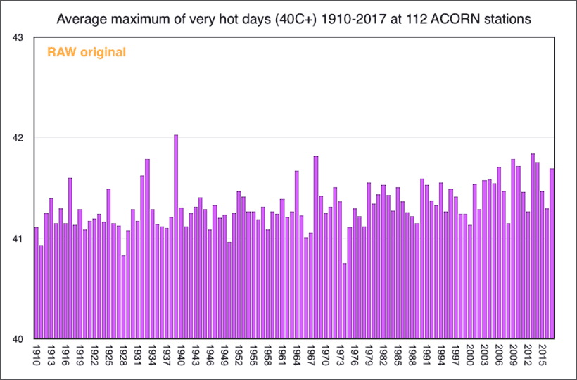
Very Hot Days, 112 ACORN Stations, Bureau of Meteorology
The average number of Very Hot Days recorded across 60 ACORN sites changes after adjustments
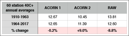
Average temperature changes in the 60 station series.
Fewer very hot days, but what about their average temperature?

…
There has been an increase since 1910, much of it following 1972 metrication and the introduction of automatic weather stations with smaller screens (0.15C warmer in 1964-2017 than 1910-1963, according to RAW). However, it seems our grandparents sweltered through a few years of record heat in the 1930s.
Again, similar among all 112 ACORN stations …
….
…
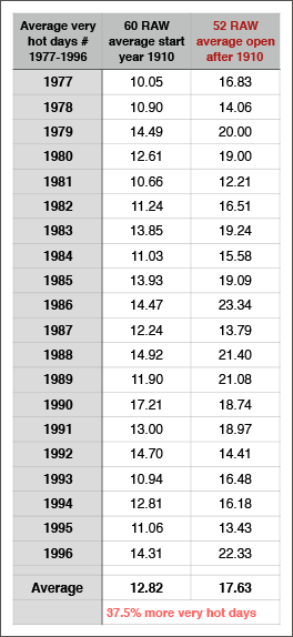
But what about those 52 stations that have opened since 1910 that our earlier comparison suggests were in hotter locations?
Just because they get more very hot days, does that mean their maxima above 40C are hotter than at the 60 original stations? Below compares the annual average of 40C+ days at the 60 stations with the 52 stations, both from 1977 to 1996

….
Yes, the 52 stations that opened between 1910 and 1976 have 37.5% more very hot days which, on average, are 0.24C warmer than the average at the 60 original stations in the same timeframe. That 0.15C warming from 1910-1963 to 1964-2017 at the 104 non-urban stations is now questionable.
And how much hotter are the very hot days at the 60 original stations?

….
Among the 60 original stations open in 1910, the very hot days were 0.09C warmer in 1964-2017 than 1910-1963, according to RAW.
Surprisingly, the ACORN 1 and ACORN 2 datasets have caused a small increase in the average maximum temperature of 40C+ days in the early 1900s.
These illogical quirks of the ACORN area average algorithms saw Albany having Australia’s hottest every day in ACORN 1 (51.2C vs 44.8C originally and adjusted back to 49.5C in ACORN 2). In ACORN 2, Oodnadatta becomes the hottest day ever recorded in Australia (51.1C on 2 January 1960 vs unadjusted raw temp of 50.7C), and Carnarvon has Australia’s second hottest ever day in 1953 (51.0C vs 47.7C originally).
Between 1910 and 1976, the gradual addition of 52 hotter weather stations has contributed to the trend and the artificial warming of the average historic temperature of very hot days.
Very hot 40C+ days are not the same as average maxima, and analysis shows ACORN 2 cooled RAW by 0.2C in 1910-1963 (RAW 25.03C to A2 24.83C).
The issue of very hot days is analysed here, with data on annual average numbers, annual average very hot day temperatures, the very hot day correlation with annual rainfall/cloudy day data since 1910, and the very hot day correlation with annual rainfall/cloudy day data only from November to April when very hot days occur.
This analysis suggests that despite ACORN homogenisation, Australia has had no increase in the number of extremely hot days since 1910.