It’s clear science journalists need some help. The IPCC are saying “The ocean ate my global warming” and most environment reporters just cut-n-paste this excuse — they fall for the breathtaking joules-to-the-22nd-figures — not realizing they convert to a mere 0.07C over nearly 50 years (as if we could measure the average temperature of the global oceans to a hundredth of a degree!). Worse, the warming we do find is so small, it supports the skeptical calculations, not the IPCC’s ones. I ran a tutorial for journalists at the end of the post, and asked Bob Tisdale (author of Climate Models Fail ) if he had some other questions. He did, oh boy, and here they are. Thanks to Bob. – Jo
—————————————————————————————————–
Questions the Media Should Be Asking the IPCC – The Hiatus in Warming
Joanne Nova asked me to suggest questions the media should be asking the IPCC about their 5th Assessment Report (AR5). I’ve provided a few examples along with background information.
This post will discuss the slowdown in global warming since 1998 (or the halt since 2001) known as the hiatus. While the hiatus in warming had been the topic of many blog posts around the blogosphere over the past few years, public awareness of the pause in surface temperature warming skyrocketed with David Rose’s 13 October 2012 Daily Mail article titled “Global warming stopped 16 years ago, reveals Met Office report quietly released… and here is the chart to prove it”.
————————————
1. Why did the IPCC simply glance over the well-known hiatus period in their Summary for Policymakers?
Background Information:
In their Summary for Policymakers of their 5th Assessment Report, the IPCC made only very brief references to the cessation of warming, coming to no conclusions about it.
In their approved Summary for Policymakers dated 27 September 2013, the IPCC states on page SPM-3:
In addition to robust multi-decadal warming, global mean surface temperature exhibits substantial decadal and interannual variability (see Figure SPM.1). Due to natural variability, trends based on short records are very sensitive to the beginning and end dates and do not in general reflect long-term climate trends. As one example, the rate of warming over the past 15 years (1998–2012; 0.05 [–0.05 to +0.15] °C per decade), which begins with a strong El Niño, is smaller than the rate calculated since 1951 (1951–2012; 0.12 [0.08 to 0.14] °C per decade)5. {2.4}
And on page SPM-13:
The observed reduction in surface warming trend over the period 1998–2012 as compared to the period 1951–2012, is due in roughly equal measure to a reduced trend in radiative forcing and a cooling contribution from internal variability, which includes a possible redistribution of heat within the ocean (medium confidence). The reduced trend in radiative forcing is primarily due to volcanic eruptions and the timing of the downward phase of the 11-year solar cycle. However, there is low confidence in quantifying the role of changes in radiative forcing in causing the reduced warming trend. There is medium confidence that internal decadal variability causes to a substantial degree the difference between observations and the simulations; the latter are not expected to reproduce the timing of internal variability. There may also be a contribution from forcing inadequacies and, in some models, an overestimate of the response to increasing greenhouse gas and other anthropogenic forcing (dominated by the effects of aerosols). {9.4, Box 9.2, 10.3, Box 10.2, 11.3}
The discussion by the IPCC includes the terms “low confidence” and “medium confidence”, indicating the IPCC hasn’t a clue about what caused the halt in warming.
————————————
2. In Figure SPM.1, the IPCC shows that hiatus periods can last for 3 to 6 decades. Why then is there no mention of that possibility in the future?
Background Information:
The IPCC has failed to address something that is blatantly obvious in their Figure SPM.1 from the AR5 Summary for Policymakers. (See the reduced size copy in my Figure 1.) Since the 1850s, and before the current hiatus, there were two multidecadal periods when global surface temperatures stopped warming and actually cooled.
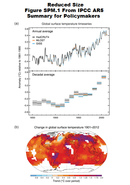
Figure 1
That means most persons will conclude that it’s very likely the current hiatus could last for at least 3 decades. See my Figure 2.
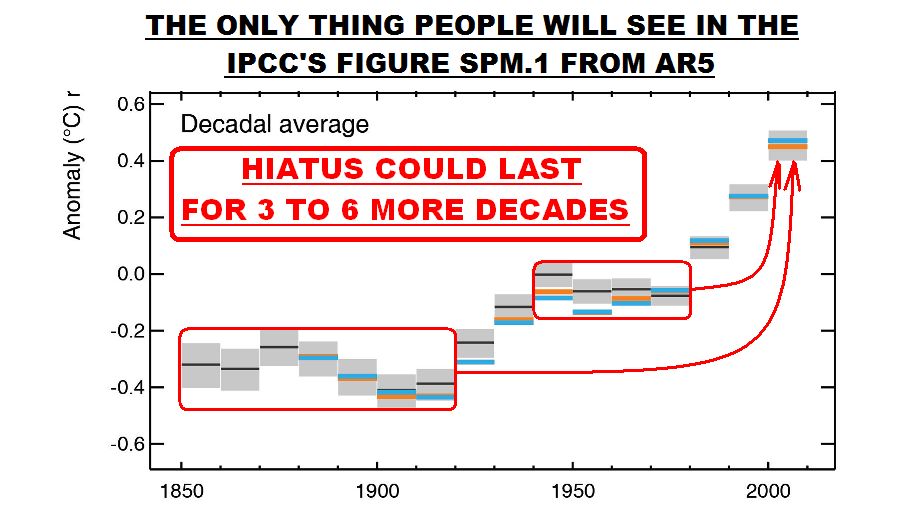
Figure 2
And that, of course, leaves questions in everyone’s minds about the validity of the IPCC 5th Assessment Report.
————————————
3. After decades of efforts, why can’t the climate models used by the IPCC simulate coupled ocean-atmosphere processes that cause multidecadal variations in sea surface temperatures and, in turn, land surface air temperatures?
Background Information:
There are a number of reasons the IPCC has avoided any discussion of the possibility the current hiatus could last for at 3 decades. First, that would mean their projections of future global warming are useless. (More on this later.)
The second reason is more damning of the climate models used by the IPCC. They cannot simulate the coupled ocean-atmosphere processes that cause multidecadal variations in observed sea surface temperatures. These processes are most evident in the sea surface temperature data of the Northern Hemisphere.
1. Atlantic Multidecadal Oscillation
(This discussion is from my recent blog post Models Fail: Land versus Sea Surface Warming Rates. I’ve changed the illustration number for this post.)
Climate models used by the IPCC for the 5th Assessment Report do not properly simulate the AMO (Atlantic Multidecadal Oscillation). In Climate Models Fail, I presented a number of scientific studies that were very critical of how models simulated many variables, including the Atlantic Multidecadal Oscillation. (See Ruiz-Barradas, et.al. (2013) is “The Atlantic Multidecadal Oscillation in twentieth century climate simulations: uneven progress from CMIP3 to CMIP5”.)
We can illustrate the Atlantic Multidecadal Oscillation using the method recommended by Trenberth and Shea (2006), and it was to subtract global sea surface temperature anomalies (60S-60N, excludes the polar oceans) from sea surface temperature anomalies of the North Atlantic (0-60N, 80W-0). They used HADISST data and so have I. In the time-series graph in Figure 3, I’ve also smoothed the AMO data with a 121-month running average filter. As shown by the blue curve, the North Atlantic has a mode of natural variability that causes its sea surface temperatures to warm and cool at rates that are much greater than the variations in the surface temperatures of the global oceans. And we can see that the variations occur over multidecadal time periods (thus the name Atlantic Multidecadal Oscillation). Keep in mind that the Atlantic Multidecadal Oscillation is responsible for some (but not all) of the warming of land surface temperatures in the Northern Hemisphere during the more recent warming period, according to the climate scientists at RealClimate. (See also Tung and Zhou (2012) Using data to attribute episodes of warming and cooling in instrumental records.)

Figure 3
If we subtract the modeled global sea surface temperatures from the modeled sea surface temperatures of the North Atlantic (shown as the red curve in Figure 3), we can see that the forced component of the CMIP5 models (represented by the multi-model ensemble mean) does not simulate the observed multidecadal variations in the North Atlantic. That is, there is very little difference between the modeled variations in global and North Atlantic sea surface temperature anomalies. The comparison also strongly suggests that the Atlantic Multidecadal Oscillation is NOT a response to manmade greenhouse gases (or aerosols) used by the climate modelers to force the warming (or cooling) of sea surface temperatures of the North Atlantic.
# # #
For further information about the Atlantic Multidecadal Oscillation, see NOAA’s AOML (Atlantic Oceanographic and Meteorological Laboratory) Frequently Asked Questions webpage here, and my blog post here and my introduction to the Atlantic Multidecadal Oscillation here.
2. North Pacific Multidecadal Variability
The North Pacific also exhibits multidecadal variations in sea surface temperatures. Unfortunately, the climate science community presents those variations in a very abstract (statistically created) form called the Pacific Decadal Oscillation. To further complicate matters, the variations in the Pacific Decadal Oscillation Index are actually inversely related to the sea surface temperatures of the region of the North Pacific from which the Pacific Decadal Oscillation index is derived. That, of course, is confusing to most persons.
In the North Pacific, the variations are dominated by the sea surface temperatures of an area east of Japan known as the Kuroshio-Oyashio Extension (or KOE). The inverse relationship between the Pacific Decadal Oscillation index and the sea surface temperatures of the Kuroshio-Oyashio Extension are shown in Figure 4. They’re basically mirror images of one another.
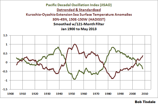
Figure 4
(Note: In Figure 4, the Kuroshio-Oyashio Extension data have been detrended, and they have been standardized (divided by their standard deviation) because the Pacific Decadal Oscillation Index is standardized.)
Because we’re interested in sea surface temperatures and not an abstract form of them, we’ll use the sea surface temperatures of the Kuroshio-Oyashio Extension for much of this discussion.
Let’s see whether the models can simulate the multidecadal variations in the sea surface temperatures of the Kuroshio-Oyashio Extension. For this example, we’ll subtract the global sea surface temperatures from the sea surface temperatures of the Kuroshio-Oyashio Extension. (It’s similar to the method used by Trenberth and Shea for the Atlantic Multidecadal Oscillation.) The coordinates used for the Kuroshio-Oyashio Extension data are 30N-45N, 150E-150W and the global sea surface temperature data are for all of the global oceans, 90S-90N. (The multidecadal variations in the Kuroshio-Oyashio data in Figure 5 are different those in Figure 4 because they were determined using different methods. Also note they have not been standardized in Figure 5.) As shown with the blue curve in Figure 5, there are very large multidecadal variations in the sea surface temperatures of the Kuroshio-Oyashio Extension after the global data has been subtracted.

Figure 5
On the other hand, using the models prepared for the IPCC’s 5th Assessment Report, we get totally different results when we subtract the modeled global sea surface temperatures from the modeled sea surface temperatures of the Kuroshio-Oyashio Extension. (See the red curve in Figure 5.) This indicates the models do not simulate the multidecadal variations in the sea surface temperatures of the Kuroshio-Oyashio Extension. Because the variations in the surface temperatures of the Kuroshio-Oyashio Extension region dominate the North Pacific, the failure of the models to show the same multidecadal variations suggests that greenhouse gases (and aerosols) used in the models are not responsible for the warming (and cooling) in North Pacific sea surface temperatures.
For further information about the Pacific Decadal Oscillation (what it is and what it is not) refer to my blog posts here, here and here.
————————————
4. Why aren’t the climate models used by the IPCC expected to simulate multidecadal variations in global surface temperatures?
Background Information:
We discussed and illustrated (above) how the climate models used by the IPCC cannot simulate the multidecadal variations in the sea surface temperatures of the North Atlantic and the North Pacific. Regarding the hiatus period, the IPCC included on page SPM-10 (my boldface):
There is medium confidence that internal decadal variability causes to a substantial degree the difference between observations and the simulations; the latter are not expected to reproduce the timing of internal variability.
One wonders how climate models can have any value at all if they are “not expected to reproduce the timing of internal variability”—especially when one considers that internal variability was a strong contributor to the warming that occurred from the mid-1970s to the turn of the century…and has now stopped that warming.
This failure to properly simulate the timing and strength of internal variability caused a former lead author of the IPCC (Kevin Trenberth) to remark in David Appell’s 7 May 2013 article “W(h)ither global warming? Has global warming slowed down?”
“One of the things emerging from several lines is that the IPCC has not paid enough attention to natural variability, on several time scales,” he [Dr. Trenberth] says, especially El Niños and La Niñas, the Pacific Ocean phenomena that are not yet captured by climate models, and the longer term Pacific Decadal Oscillation (PDO) and Atlantic Multidecadal Oscillation (AMO) which have cycle lengths of about 60 years.
Additionally, the Royal Netherlands Meteorological Institute (KNMI) recently prepared and presented their recommendations for the future of the IPCC. [Refer to their document titled Submission by The Netherlands on the future of the IPCC.] Under the heading of “The IPCC needs to adjust its principles”, KNMI begins:
We believe that limiting the scope of the IPCC to human-induced climate change is undesirable, especially because natural climate change is a crucial part of the total understanding of the climate system, including human-induced climate change.
————————————
5. Why has the IPCC chosen to hide the fact that climate models cannot simulate the hiatus in global warming?
Background Information:
My Figure 6 is the approved final version of Figure 1.4 from Chapter 1 of the IPCC’s AR5. It compares observed global surface temperature anomalies to the spaghetti plot of outputs from the climate models prepared for the 4th Assessment Report (AR4) published in 2007, using a number of scenarios. (Scenario A1B was used and presented most often by the IPCC in AR4.) Also included in their Figure 1.4 are ranges of model predictions from prior assessment reports: FAR is the 1st Assessment Report, SAR is the 2nd, and TAR is the 3rd. Notice how it shows the last few years of global temperature data within the extreme lower range of the climate model outputs. This suggests a few of the models (the models with the very slow warming rates) capture the slowdown in warming since 1998…and the cessation of warming we’ve been experiencing since 2001.
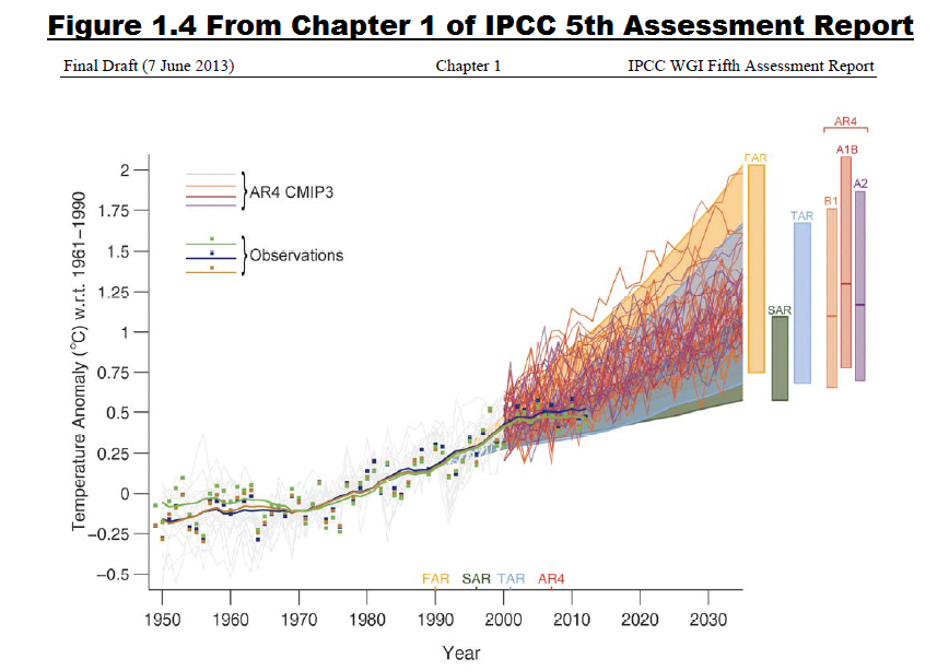
Figure 6
It’s difficult to imagine why the IPCC would include the model outputs from the 1st, 2nd and 3rd Assessment Reports, they were obsoleted by models used in the 4th Assessment Report, or why the IPCC would include the scenarios of the 4th Assessment Reports where greenhouse gas emissions were less than those that have occurred. Clearly, by including all of these meaningless model outputs, their intent was to hide the fact that the models most widely used in the 4th Assessment Report failed to simulate the hiatus period.
I have included here as my Figure 7 the former version of the same illustration (Figure 1.4). It is from the Second Order Draft of Chapter 1 of the IPCC’s 5th Assessment Report. In it, the observed global surface temperatures in recent years are below model prognostications. Clearly, the final version (Figure 6) is attempting to hide the fact that the models have grossly overestimated the warming.
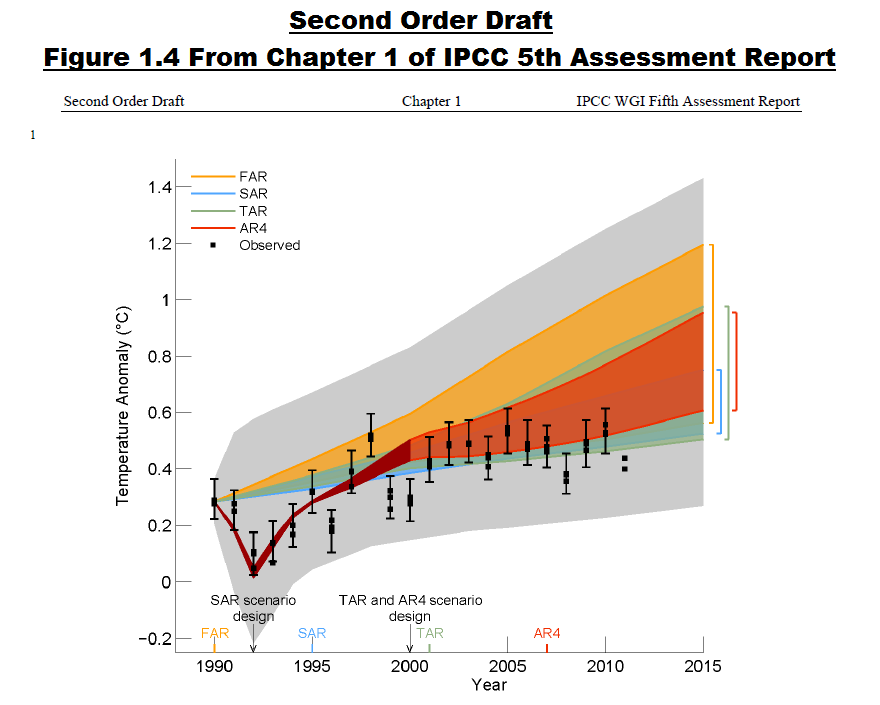
Figure 7
Keep in mind, the illustration in the Second Order Draft (Figure 7) was prepared by climate scientists for politicians, and that the changes (Figure 6) were required by the politicians who approved the IPCC’s AR5.
It’s obvious that because the models cannot simulate the absence of warming, they cannot be used to attribute to manmade greenhouse gases the warming that occurred from the mid-1970s to the turn of the century—and they cannot be used to project future global surface temperatures. It’s no wonder the politicians who approved AR5 requested/required that change.
————————————
6. Why is the IPCC defining the hiatus period with the start date of 1998, or with a 15-year period, when the surface temperatures of many parts of the global oceans have not warmed (or have actually cooled) for 20 years to more than 30 years? And why do the climate models used by the IPCC show warming in those ocean basins?
Background Information:
In all of the discussions of the global warming hiatus in AR5, the IPCC starts the hiatus period in 1998, limiting the hiatus period to the last 15 years. They also limit the presentation to the data and models that represent the combined global land surface air plus sea surface temperatures. This discussion shows that the hiatus period has lasted much longer than 15 years in some ocean basins.
For the past couple of years, I have been presenting model-data comparisons for sea surface temperature anomalies during the satellite era. I also included more up-to-date versions of those comparisons in my recently published book Climate Models Fail. The following graphs are from the book.
(Note: this discussion includes the latest and greatest models prepared for the IPCC’s 5th Assessment Report, as represented by the multi-model ensemble-member mean of the sea surface temperature simulations.)
The Southern Ocean (90S-60S) surrounds Antarctica. With the Antarctic Circumpolar Current, the Southern Ocean serves as the hub for the Atlantic, Indian and Pacific basins. Spatially complete sea surface temperature data have only been available for the Southern Ocean since the early 1980s with the introduction of satellite-based measurements. Over the past 3+ decades and based on the linear trend, the sea surface temperatures of the Southern Ocean have cooled, Figure 8, but the models show they should have warmed if sea surface temperatures were warmed by manmade greenhouse gases.

Figure 8
As defined by the coordinates of 90S-90N, 180-80W, the Eastern Pacific Ocean stretches from pole to pole and from the dateline to Panama. The East Pacific covers approximately 33% of the surface of the global oceans. The sea surface temperatures for the East Pacific (Figure 9) show little to no warming for more than 3 decades, based on the linear trend. On the other hand, if sea surface temperatures were warmed by manmade greenhouse gases, climate models show the sea surface temperatures of the East Pacific should have warmed about 0.45 deg C in that time. Apparently, the surface of the East Pacific Ocean has not been warmed by manmade greenhouse gases.

Figure 9
Using the coordinates of 60S-65N, 120E-80W, the sea surface temperature data for the entire Pacific Ocean is shown in Figure 10. The Pacific Ocean is so large it covers more of the surface of the planet than all of the continental land masses combined. Yet, based on the linear trend, the surface of the largest ocean on Earth has not warmed in 2 decades. Contrary to the observations-based data, the models indicate the surface of the Pacific Ocean should have warmed about 0.4 deg C in that time—under the obviously flawed assumption that manmade greenhouse gases warm the surface of the Pacific Ocean.

Figure 10
(Note: For those with a copy of my recent book, Figure 8 is Figure 7-6 in Climate Models Fail. Figure 9 is Figure 7-31 in the book and Figure 10 is Figure 7-26.)
SUMMARY
The IPCC’s 5th Assessment Report was obviously incomplete in its portrayal and discussion of the recent hiatus in global warming. Some people might even go so far as to say the IPCC has misled the public and policymakers intentionally.
DATA SOURCE

(Click the book to find out more).
The data and model outputs presented in the graphs prepared by me for this post are available through the KNMI Climate Explorer. For those who would like to replicate my graphs, refer to my blog post Step-By-Step Instructions for Creating a Climate-Related Model-Data Comparison Graph.