Not many people realize just how utterly unprecedented the Global Financial Crisis was.
To see just how singularly anomalous those months were, let’s revisit an article I wrote for 321 Gold in November 2008.
The graphs below are extraordinary, jaw-dropping plots. At the time I was watching them grow week by week, and was amazed that they were not “everywhere”. I still remember the chill I got in mid October when I first saw the ballistic spike. We’re talking about the money supply of the worlds largest economy. The rescue package blew away the scale — the second graph below covers 90 years. It’s not often you see any graph which is a true hockey stick. This was originally published at 321Gold on Nov 25th 2008. Remember this money (your money if you hold US dollars) was “injected” as a temporary fix (in theory), the plan was to neutralize it, or sterilize it, or insert-your-favourite-euphemism-here-for-getting-it-back-to-normal.
So where does the Money Base graph stand now? It’s not back down to $900 billion (where it was in August 2008), it’s not even stable at $1500 billion, it’s $2000 billion. Our markets run on ever increasing injections of new money. The people in the center of these markets–the banking class (many of whom are Wall Street types with big bonuses)–are the same ones who want a carbon trading scheme.
I pointed out that Ben Bernanke’s Helicopter (also known as the US Federal Reserve) was dumping dollars on the bankers. As a corollary, that had to be good for the gold market. At the time gold was selling for around US$700 per ounce. Tonight it’s $1220 (a 75% rise). Not many other market sectors can match that. On another day I’ll explain why gold is the only currency that governments can’t control (in the long run), and why it’s more important than the economic politically-correct litany would suggest. For the moment, ask yourself why the Money Base data is not reported on the front page of newspapers?
By the way, did you get some of the cash stashed in that rescue package?
Ben’s Helicopter Drop is Here
…and it’s Good for Gold
Joanne Nova
Nov 25, 2008
This is a graph to take your breath away.
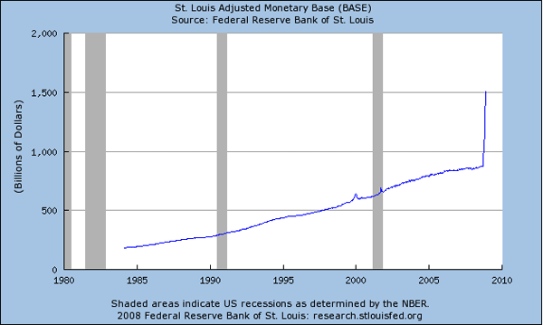
St Louis Adjusted Monetary Base 1984-2008
This is what the start of hyperinflation would look like.
This is the US money base – the total of all currency and reserves of commercial banks in the central bank itself. It’s the narrowest form of monetary aggregate (but getting fatter fast). Banks create loans from base money, so in theory this recent expansion should turn up in broader monetary aggregates in the future.
Ben Bernanke earned the nickname ‘Helicopter Ben’ in 2002 when he repeated Milton Freidman’s comment that money could be “dropped from helicopters” if needed, to avert a deflationary depression. As a student of the great depression Bernanke has also been outspoken about his desire to avoid repeating the mistakes of that era, meaning he’d strongly prefer inflation to deflation.
Because the gold standard was dropped in 1971, money can be effectively created out of thin air. So it is no surprise to find that since September, newly created money has been raining from the sky. (Apparently this rain falls only on banks and a few large financials.)
The scale is unlike anything seen since the US Federal Reserve was formed in 1913. As the weeks progress on, all previous giant distortions shrink to goosebumps as the scale of the graph is redrawn.
In the two months after September 24th, over 550 billion new dollars were made from thin air and added to the US money base. That translates to 58% growth of the total US money base in just two months. (Annualized, that would be 350%. Watch out Zimbabwe.)
Most years, base money grows at around 1-2% per month and has only grown faster than 5% per month a few times. But the graph line ‘went vertical’ in September, (then got worse in November). The growth in money supply since then was larger than the total money base that existed in 1999, and it was twice as fast as the worst single month during the depths of the depression or the height of World War II.
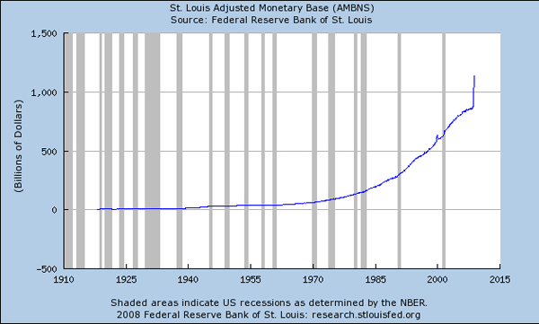
St Louis Adjusted Monetary Base (AMBNS) 1918-2008
It’s not often you can see one month changes that dominate a 100-year graph.
The potential rapid inflation in the US dollar that is likely to come from such a massive dilution of the currency can only be good for gold and silver – the only currencies that can’t be easily diluted.
There are now potentially 100% more US dollars for each gold ounce than there were in total in 2003, and here’s the scariest part: there are now 50% more US dollars in the monetary base than there were seven weeks ago.
Nov 24, 2008
Joanne Nova
Yada yada yada… This is not investment advice. It does not represent a recommendation to buy, sell or hold any security.
ADDENDUM: Tim suggests the graph is misleading because it doesn’t use a log axis. It’s an interesting thought, but I disagree, for two reasons.
- As I stated in the text, I have looked at this month by month, and calculated the percentage growth, which was twice as fast as the worst single month during the depths of the depression or the height of World War II.
- The public need to know what’s happening to their money in the simplest most understandable form there is. That doesn’t mean a log graph isn’t also useful, but let’s start with the basics.
That said, it’s useful to see the month-by-month percentage changes, which I calculated and used in the Carbon is a Fiat Currency paper last February for SPPI. It’s still a hockey-stick. As I said, the scale of the interventions is not like anything that’s been done before.
 Click on the graph to see a larger version.