Here’s why it’s possible that doubling CO2 won’t make much difference.
The carbon that’s already up in the atmosphere absorbs most of the light it can. CO2 only “soaks up” its favorite wavelengths of light, and it’s close to saturation point. It manages to grab a bit more light from wavelengths that are close to its favorite bands, but it can’t do much more, because there are not many left-over photons at the right wavelengths.
The natural greenhouse effect is real, and it does keep us warm, but it’s already reached its peak performance.
Throw more carbon up there and most of the extra gas is just “unemployed” molecules.
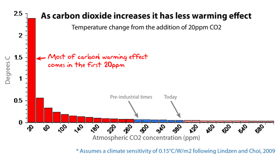
This graph shows the additional warming effect of each extra 20ppm of atmospheric CO2.
AGW says: The climate models are well aware of the logarithmic absorption curve, and use it already.
Skeptics say: The models make brutal estimates and many assumptions (guesses). “Lab-warming” doesn’t necessarily translate to “planet-warming”: Test tubes don’t have ocean currents, clouds, or rain. The “clouds and humidity” factor is bogglingly complex. For example, high clouds tend to warm the planet, but low clouds tend to cool it. So which effect rules? Models don’t know, but they assume clouds are net-warming. This is not a minor point: The feedback from clouds and humidity accounts for more than half of carbon’s alleged effect. E’Gad.
AGW says: It’s not 100% saturated.
Skeptics say: True, but meaningless. Log curves never get to 100% (so even the air on Venus, which is almost pure CO2, does not absorb 100% of the infrared light). Every CO2 molecule will increase warming by a small amount ad infinitum, but it has less effect than the CO2 that’s already up there.
And the effect is already so small, it’s unmeasureable.
Conclusion: If adding more CO2 to the sky mattered, we would see it in ice cores and thermometers. We don’t. Ergo, carbon’s effect is probably minor.
REFERENCE: Archibald, D. (2007) Climate Outlook to 2030, Energy and Environment, Vol 18, No 5. [UPDATE Added, 4 April 2018]
Notes about page 8 of The Skeptics Handbook:
When someone pointed out this basic chemistry to me, it resonated, and again I marvelled that something so basic had been carefully not mentioned in this debate. I realize log curves are not something you want to reach out to the public with in detail, but I felt everyone who has done chemistry at university would grasp this point quickly. It explains the paradox: It’s true that carbon has some warming effect, but it’s also true that extra carbon doesn’t have the same effect. When alarmists point out that the natural greenhouse effect causes “X degrees of warming,” they usually fail to mention that the first 100pm does almost all of this, and no extra 100ppm addition will ever do as much. It’s a lie by omission.
The graph in the first printed edition of The Skeptics Handbook is shown below, and comes from David Archibald, who was the first to arrange the results in this powerful format. It’s a good graph, and he deserves credit for being the one to capture the increasing ineffectiveness of carbon very well. This was calculated (like the top graph) using Modtran, which is a model provided by Spectral Sciences and the US Air Force, and used by researchers around the world.
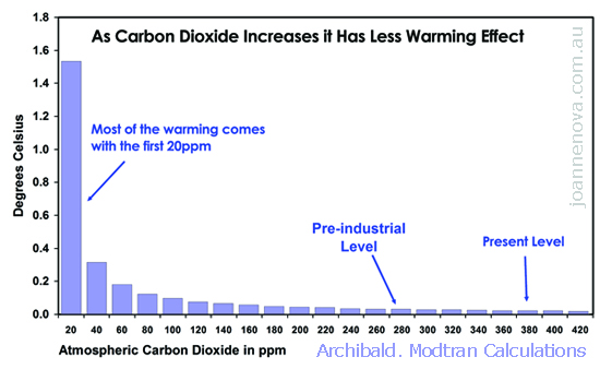
Archibald based his figures on a climate sensitivity calculated by Craig Idso and published in peer reviewed literature (Idso 1998). The graph itself was not published in peer reviewed paper*. The top graph above comes from Patrick Michaels, and was also constructed on Modtran. It started with a climate sensitivity estimate from Richard Lindzen in his recent ERBE paper (Lindzen and Choi 2009). Useful discussions on the observational backing for a low climate sensitivity are at Friends of Science and Niche Modelling.
The two log curves here are not that different (which is one of the things about a log curve: Once you get past the initial slide, it’s all “small” or “smaller”). Overall, both graphs accomplish what I wanted; namely, to show that the basic effect of carbon dioxide on it’s own dwindles to almost nothing. Sure, each extra molecule of carbon makes a little difference, but it becomes less and less so, and there’s a point where it’s irrelevant and unmeasureable. We’re not at that point yet. Even if doubling carbon leads only to a 0.5 degree difference on a global scale, it’s arguably still measurable (well, at least theoretically).
My point with this page was not that we could use Modtran to calculate whether there is a crisis due to carbon. I was not so much interested in the exact numbers as in the shape of the curve. From a science communicator’s point of view, this is basic science: Additional carbon has less effect. But, can anyone find a school climate education program with this chemistry?
The exponential “hockey-stick” curves of the IPCC et al emphasize just how much difference extra carbon supposedly makes. Few people realize that the exponential rising curves come from feedback factors (which are the fatal flaw of the science behind the scare campaign).
Attacks on this page
There have been plenty of people who claim the log graph is totally, completely, utterly wrong. Desmog argued that Earth’s atmosphere wasn’t even close to saturated: “…look at Venus.” So I did, and demolished that point in this reply. (Basically, Venus’s atmosphere is 90 times denser than Earth’s. No wonder it’s hot. It wouldn’t matter what gas was in it’s atmosphere).
Other people come out with irrelevant things, like the Idso paper is “old” (so is the theory of gravity). They launch ad hominem attacks on Archibald, and claim the graph is not peer reviewed. Their most inflated argument is that the creator of Modtran says Archibald misused it. But in the cold light of day, it only means that the guy who developed the web interface for the Modtran model didn’t like the climate sensitivity that Archibald chose. And we are supposed to care?
*UPDATE:
David Archibald writes in #104
The graph’s first outing, in 2006, was in a peer-reviewed paper, published in Energy and Environment. Thanks for republishing.
David