These maps and graphs make it clear just how brazenly unscientific the Hockey Stick is.
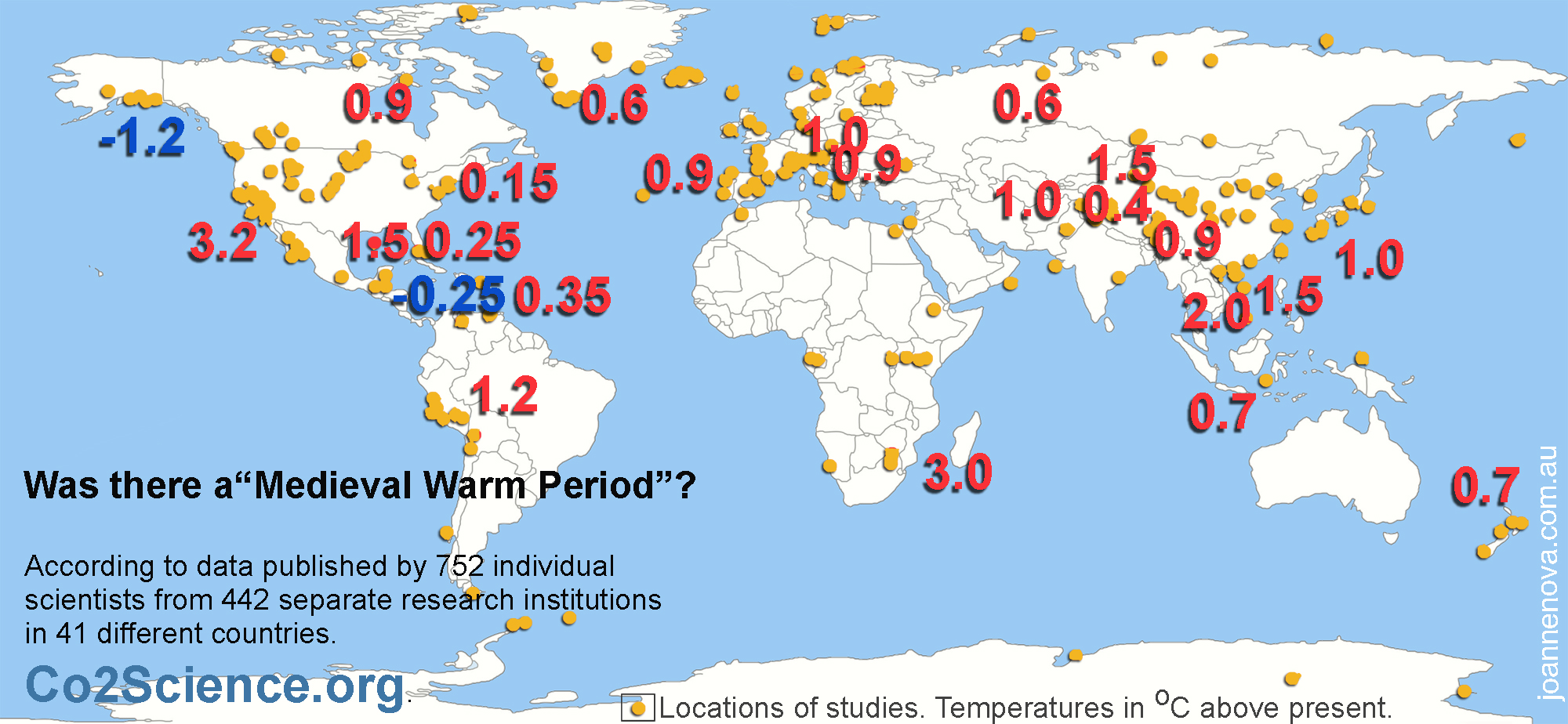
It’s clear that the world was warmer during medieval times. Marked on the map are study after study (all peer-reviewed) from all around the world with results of temperatures from the medieval time compared to today. These use ice cores, stalagmites, sediments, and isotopes. They agree with 6,144 boreholes around the world which found that temperatures were about 0.5°C warmer world wide.
***UPDATED: For more details on what boreholes show see this detailed post which updates this one. While other proxies give us information on the relative temperature and the timing, boreholes suggest the warming was global. Climate models don’t explain past global temperature swings. They don’t understand all the factors that drive the climate. The fact that the IPCC ignored this graph, which at the time agreed with most proxies, tells us the IPCC is not driven by science but by politics. The way the interpretation of borehole results have swung wildly reflects how politicized science has become.
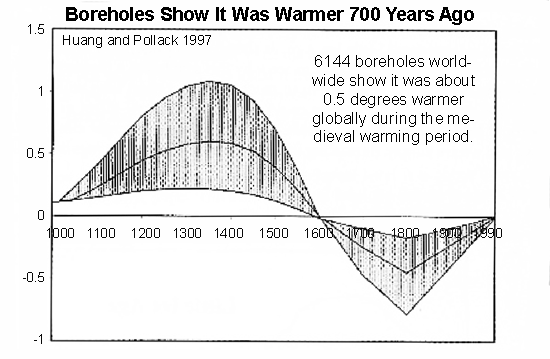
*UPDATE: This graph is from McKitrick & Essex based on data provided by Huang in 2002 from the 1997 paper. In 2008, HP published a different analysis, came to a similar curve, but cooler results, and belatedly said this graph above really ends in about 1900, not 1990. I’ll be updating on the complexity of boreholes and will post that link here soon (Nov 2012).
What follows is a sordid tale of a graph that overthrew decades of work, conveniently fitted the climate models, and was lauded triumphantly in glossy publication after publication. But then it was crushed when an unpaid analyst stripped it bare. It had been published in the highest most prestigious journal, Nature, but no one had checked it before or after it was spread far and wide. Not Nature, not the IPCC, not any other climate researcher.
In 1995 everyone agreed the world was warmer in medieval times, but CO2 was low then and that didn’t fit with climate models. In 1998, suddenly Michael Mann ignored the other studies and produced a graph that scared the world — tree rings show the “1990s was the hottest decade for a thousand years”. Now temperatures exactly “fit” the rise in carbon! The IPCC used the graph all over their 2001 report. Government departments copied it. The media told everyone.
But Steven McIntyre was suspicious. He wanted to verify it, yet Mann repeatedly refused to provide his data or methods — normally a basic requirement of any scientific paper. It took legal action to get the information that should have been freely available. Within days McIntyre showed that the statistics were so flawed that you could feed in random data, like stock prices, and still make the same hockey stick shape nine times out of ten. Mann had left out some tree rings he said he’d included. If someone did a graph like this in a stock prospectus, they would be jailed.
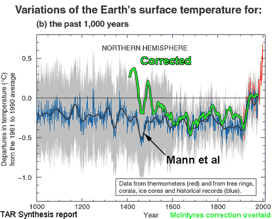
Astonishingly, Nature refused to publish the correction. The correction was published elsewhere, and backed up by the Wegman Report, an independent committee of statistical experts.
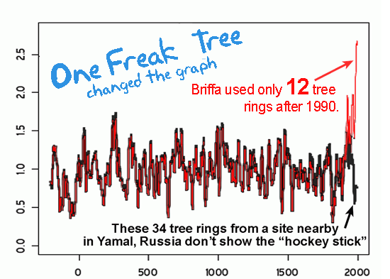
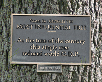
In 2009 McIntyre did it again with Briffa’s Hockey Stick. After asking and waiting three years for the data, it took just three days to expose it too as baseless. For nine years Briffa had concealed that he only had 12 trees in the sample from 1990 onwards, and that one freakish tree virtually transformed the graph. When McIntyre graphed another 34 trees from the same region of Russia, there was no Hockey Stick.
The sharp upward swing of the graph was due to one single tree in Yamal. Epic cherry-picking!
Skeptical scientists have literally hundreds of samples. Unskeptical scientists have one tree in Yamal, and a few flawed bristlecones…
It was a audaciously unscientific.
Climate models don’t know why it was as warm years ago.
The models are wrong.
The so-called “expert review” is meaningless. The IPCC say 2,500 experts review their reports, but those same “experts” made the baseless Hockey Stick graph their logo in 2001.

Craig Loehle used 18 other non-tree-ring proxies. Temperatures were higher 1000 years ago, and cooler 300 years ago. We started warming long before cars and powerstations were invented. There’s little correlation with CO2 levels.
UPDATE: Oct 26 2012 Craig Loehle published a newer version of this graph in 2008 which he noted at the time produced “little change in the results.”. In the interests of transparency, so people can judge for themselves, you can compare those two graphs above and below. A larger, longer more detailed study of the Northern Hemisphere was done by Ljundqvist in 2012. h/t to “NiceOne”. There is still clearly no correlation with CO2 levels, nor do the climate models reproduce the MWP.

Loehle 2008. Note the graph ends in 1935, not 1980.
…
Sources: Loehle 2007, Haung and Pollack 1997, See co2science.org for all the other peer reviewed studies to go with every orange dot on the map. McIntyre & McKitrick 2003 and 2005, and update, Mann et al 1998, Briffa 2006, read McIntyre at climateaudit.com, see “ClimateGate”, and Monckton “What Hockey Stick” (Science and Public Policy Institute paper)
TURN THE PAGES (Links in red will become active as pages are published). You are on the page in the Red Square.
| 1 | 2 | 3 | 4 | 5 | 6 | 7 | 8 + 9 | 10 | 11 | 12 | 13 | 14 | 15 | 16 | 17 | 18 | 19 | 20 |
This is Page 12 of The Skeptics Handbook II, a 20 page PDF.
I know a similar graph went up a couple of days ago around the web. The Skeptics Handbook II was published on Friday Nov 20.
ACKNOWLEDGEMENTS: Thanks to Craig Idso of CO2science.org for his fabulous collation of research and his Medieval Warming Project which is an excellent resource, try the animated map! A big thank you to John N for his work in helping to create the map.
—————————————————
UPDATE 5-Dec-2009: Information on the Map “dots”
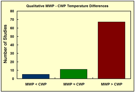
The world map was created by looking at studies listed on Co2science.org. Craig Idso divided up studies into three different levels. Level 1 is the most useful, because they are able to tell us, not just whether the world is warming or not, but but also give a number. The level 2 studies just tell us whether things were warmer or cooler at that location, and with a specific timeframe. The level 3 studies are useful for pinpointing the time frame of the warming. All three levels are represented by orange dots. The numbers come from the level 1 studies. I did not put all the positive ones I could find because there were so many, but I included all the negatives I came across.
There are 57 studies of a level 1 category. There was clearly a warm period and it was clearly global.
This kills the line that the warm period was a “regional phenomenon”.
UPDATE: Information on Boreholes
Huang has published papers after 1997. Tellingly the one he published in 1998 (after Mann’s graph came out) dropped 95% of the data and only focused on the last 500 years. That’s one way to get yourself included in an IPCC report isn’t it? Ignore the other 95% of all your own work.
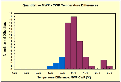
Huang published another in 2008 where he discounts the meaning of his earlier work. OK. So his opinion is worth considering. Lets consider how convincing his points are. Boreholes are supposed to be good because they are measurements of real temperatures rather than a “proxy”, but make no mistake, it takes a fair bit of interpretation to say exactly how hot it was in 1066 by digging a hole and taking the temperature a long way down. Huang had three different reconstructions for the medieval warm period in 1997: “a” was 0.2 degrees warmer, “b” was 0.5 degrees warmer, and “c” was 1.0 degrees warmer. Which one is more likely? How about the one closest to all the other types of proxies out there… Craig Idso writes that when they put all the level one studies together the number “most quoted” is 0.75 degrees above today (See the graphs below). He thinks the number is even higher (see his reasons below).
Boreholes on their own are not much good at telling us in absolute terms exactly how hot any era was, but they are good for giving us global century by century comparisons. Their big problem is that they can’t do the last century well, since the surface of the land is affected by shorter swings and by non-climatic effects.
Huang’s reasons for discounting his earlier work essentially say “my new graphs match the IPCC better”, but since ClimateGate blows away the pretense that the IPCC is a reasonable source of info, and that Mann, Briffa and all their derivatives are meaningful, I think we can “discount” Huang’s reasons.
Craig Idso emailed me about the question of the “average temperature” of the medieval warm period.
“As for the degree of warmth, we do not try to compute a grand mean for all level 1 studies. This is because of the different paleo proxies and methods used, and because not all the temperature values are for the calendar year. Many are for specific months, groups of months or seasons. So one can’t really compute a grand mean (and we don’t try to on the website). About as far as we go is to present a range distribution of all level 1 studies, which clearly demonstrates that no matter the method, the MWP was in nearly all instances, warmer. Bottom line, we feel the MWP project addresses the contention of (1) whether or not there was a MWP, (2) was it warmer (qualitative) than the current period, and (3) was it of a longer duration than the current warm period. To those issues, we feel the preponderance of evidence from the level 1, 2, and 3 studies indicates the answer to the question “Was there a Medieval Warm Period?” is a resounding YES.
With respect to the amount of warmth, again, I don’t think one can actually compute this due to the different period of time and proxies used, and the errors and calibrations associated with each study. But even if you took the apple-to-orange comparison and computed a grand mean of all the Level 1 studies, you presently get a value of about 0.8 to 0.9°C, which is not far off the 0.5°C in the borehole study. Personally, it is my belief that paleo proxies slightly dampen the highs and lows of the temperature record from what they truly are. Thus, the MWP was probably about 1 to 1.2 degrees warmer than present, which brings up the last issue, to what period of time are we comparing the MWP to the CWP. We try to be consistent, but cannot always be for one reason or another. Generally, we look for peak warmth in the MWP and compare that to peak warmth in the CWP (of the past three decades) from an author’s figure. Sometimes the authors do not provide a figure, but give us a number.”
Craig Idso
The bottom line is that there are a mass of studies that show it was warmer in medieval times, and that it was global. Yet there is a disinformation campaign out there by the IPCC and others to promote the idea that it was a local phenomenon and that the Hockey Stick Graph has not been resoundingly, completely shown to be scientifically baseless.
—————————–
UPDATED: The line “the world was warmer than 800 years ago” was changed to “the world was as warm years ago” to reflect updated results from boreholes that I was unaware of when this was posted. It makes little material difference to the arguments for or against CO2 whether the world was warmer or as warm 800 years ago, or 1000 years ago. We know it was warmer 5000 years ago in the holocene.
UPDATED: In light of current court cases the word “fraud” was replaced with “unscientific” pending the outcome of their decisions.